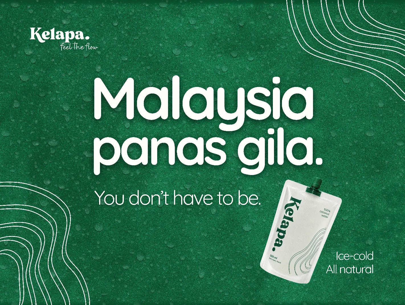
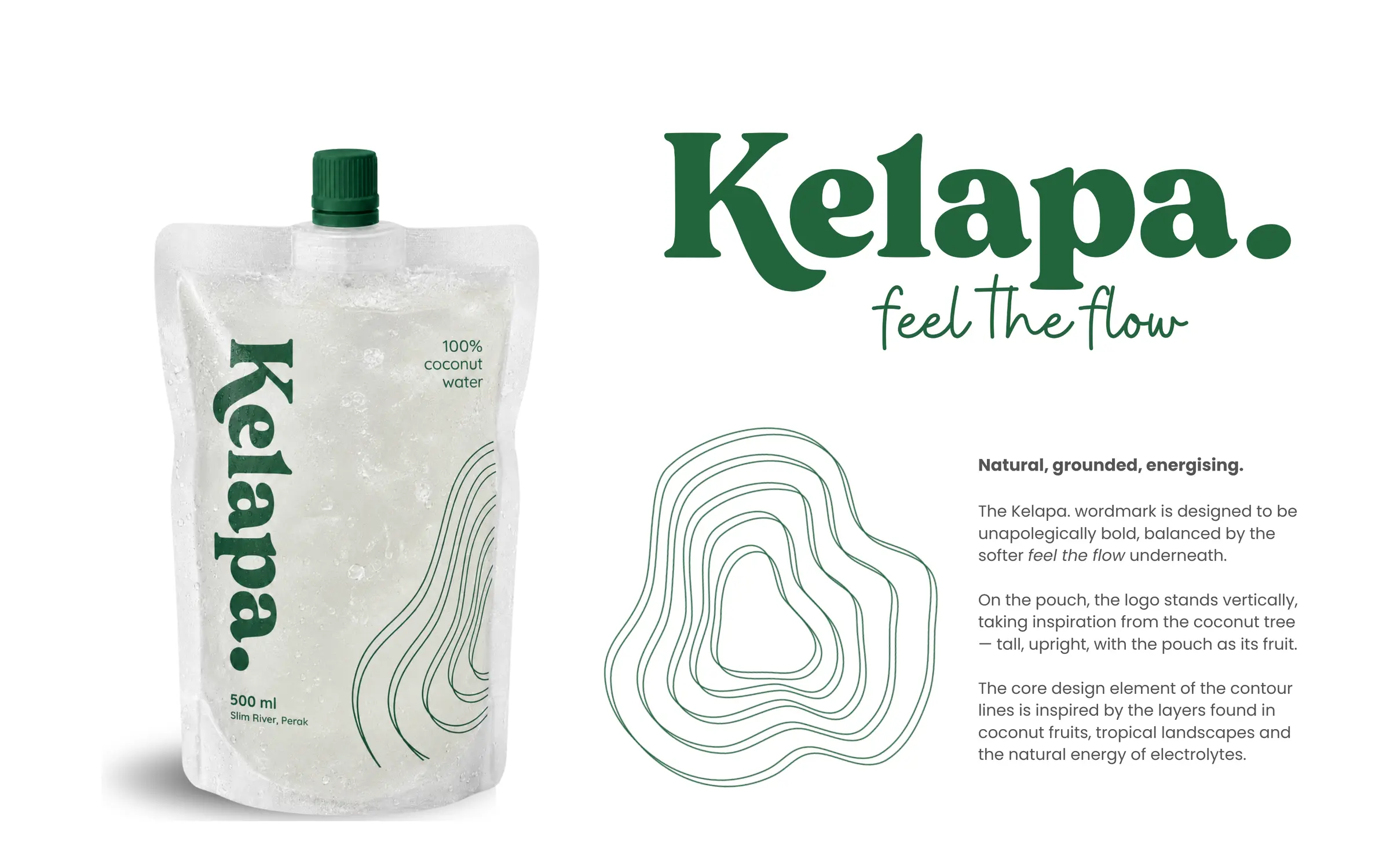
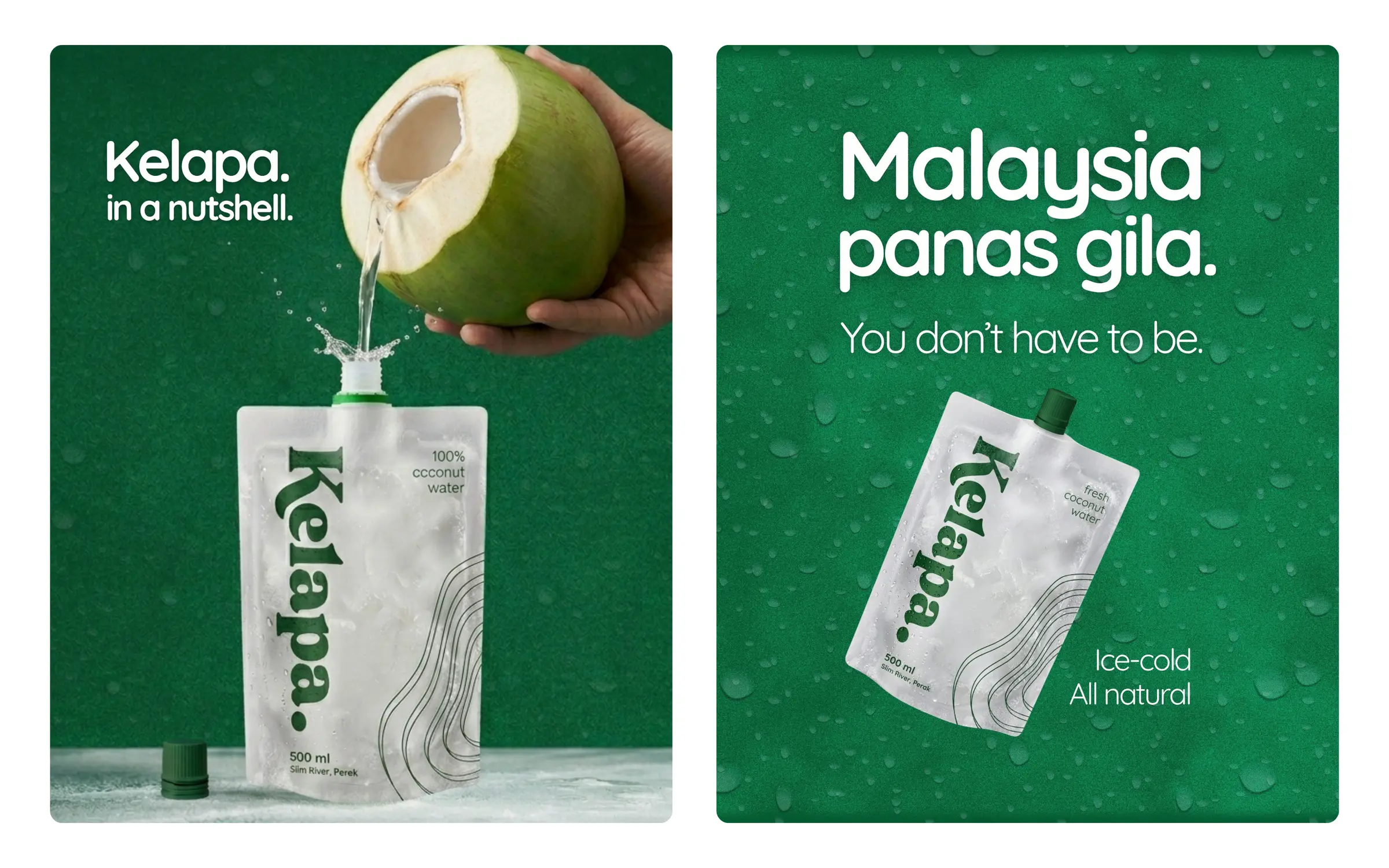
Kelapa. came to us with a logo and product already in market, but without an identity or voice strong enough to command attention. The challenge was to build distinction around a familiar Malaysian product and make the pouch itself worth noticing.
The human truth
Kelapa. layered right
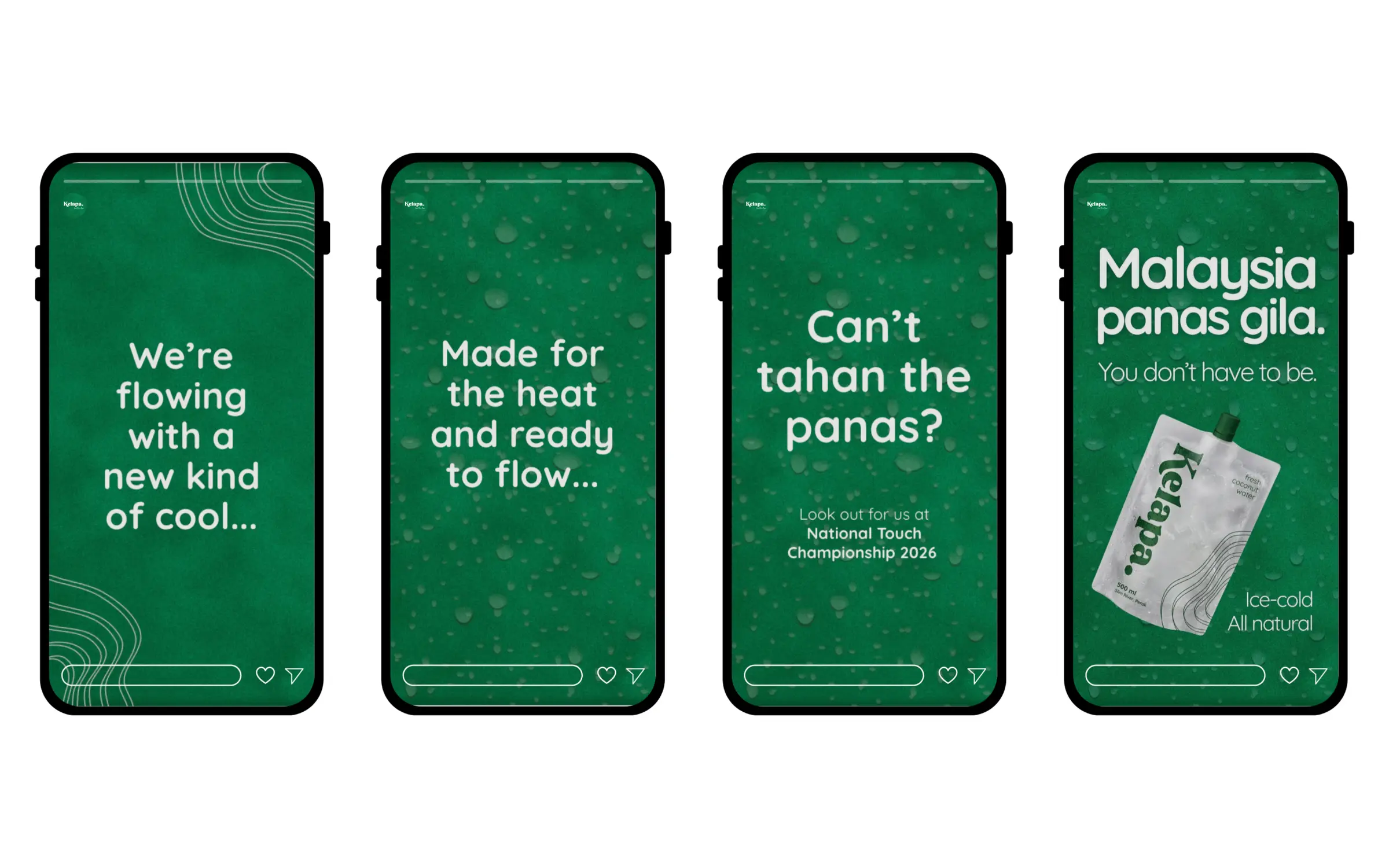
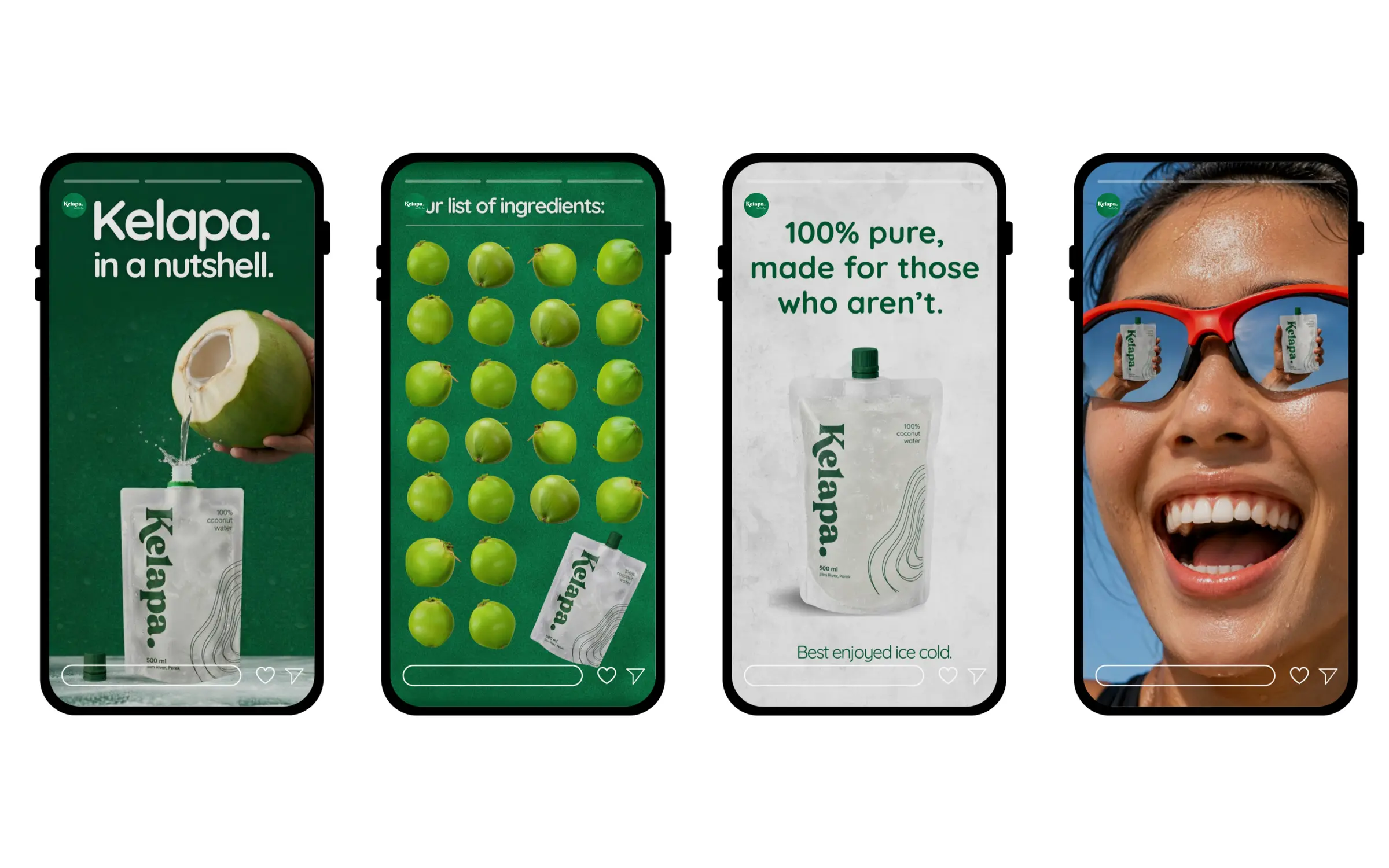
The identity began with the coconut – husk, shell, flesh and water. Those layers became the contour lines running through the brand. Forest green grounded it in Malaysia, condensation made the cold visible and a bold vertical wordmark echoed the upright coconut tree.
The move
Live and turning heads
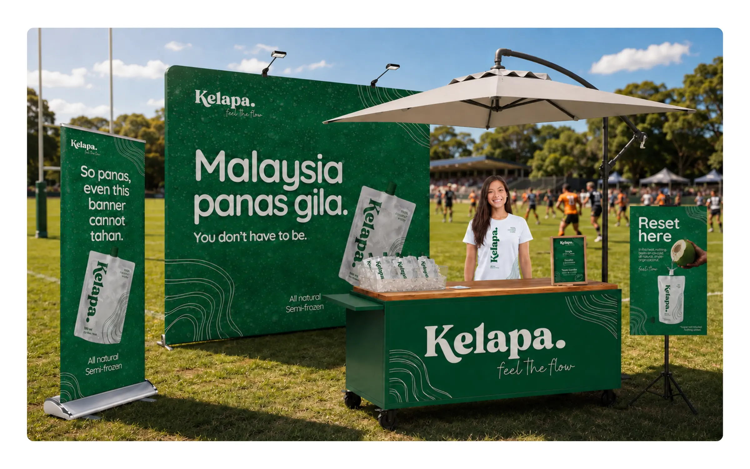
The new identity moved through packaging, point of sale, social content and the National Touch Rugby 2026 activation. People who once walked past began stopping, photographing and buying the product because the branding finally gave the pouch something to say.